The choice of font plays a huge role in the final outcome of laser engraving projects. Selecting the right one can elevate your designs by adding clarity and aesthetic to them. They can make your laser engraved products stand out of the generic ones.
The best fonts for laser engraving are those that are simple, clear, and legible. It’s possible to carve sharp outlines with typefaces that feature clean, bold lines. And the good news is you don’t always need to get a premium option for precise, high-quality results.
In this article, we’ll discuss some popular laser engraving fonts that can maintain readability on various materials. You’ll also get to know about how to adjust these fonts in engraving for better results and some of their applications.
Best Fonts for Laser Engraving
The best fonts for laser engraving must be versatile because you want them not only to look great, but also maintain their structural integrity and legibility even under the intense heat of the laser cutting machine.
You also have to consider the font thickness. It’s because delicate, thin fonts may become distorted or even disappear entirely during the engraving process. But extremely thick typefaces are not ideal too as they can overwhelm the design and make it difficult to read. You have to choose one that has a medium to bold weight version.
For maximum effectiveness, prioritize fonts with clear, distinct letterforms. Avoid overly ornate or script-like styles, as they can become muddled or indistinct when engraved. Classic sans-serif or slab-serif fonts are often the most legible choices.
Why Font Choice Matters in Laser Engraving
Fonts in laser engraving designs can affect everything from how easy it is to read the engraving to how well it holds up over time. Here are some reasons why the font choice is important in engraving:
a. Readability and Clarity
Legibility is one of the most important factors to consider. The whole point of engraving text is to make sure it’s clear and easy to read. Fonts with sharp, well-defined lines, like sans-serif fonts such as Arial or Helvetica, tend to work best. These fonts are simple and don’t have the extra little flourishes of serif fonts, which can get distorted in the engraving process.
b. Material Compatibility
Different surfaces respond to engraving in different ways. For example, materials like wood have natural grains that can interfere with delicate font details, making intricate fonts harder to read. But metal or acrylic tends to capture more detailed designs well.
Understanding how your material behaves will help you choose a font that is readable and looks great after engraving.
c. Structural Integrity
If you choose a font with thin, delicate lines, there’s a higher chance the engraving might not hold up, especially on tougher materials. The finer details could break off, leaving a messy or incomplete design. Bold fonts with thicker strokes are a safer bet for ensuring the text stays intact and the engraving doesn’t get muddled.
d. Aesthetic Alignment
Fonts do more than just communicate words—they set the tone of your project. A professional design will benefit from classic fonts like Calibri or Arial Black, while a fun, playful design might call for something more casual, like Comic Sans MS. The right font can link up between the aesthetic and purpose of the project.
e. Engraving Technique Compatibility
The engraving method you use matters, too. Raster engraving, which fills in areas, works better with fonts that have a solid body. On the other hand, vector engraving, which follows the outline of a design, requires fonts with clear, continuous lines. Understanding the differences between these techniques is important to select the most suitable typeface.
Top Fonts for Clean and Readable Designs
Below are some of the best fonts for laser engraving, each with unique qualities that make them stand out.
1. Arial
Arial is a classic sans-serif font known for its simplicity and clear lines. This font is a go-to choice for laser engraving because of its uniform stroke width, making each character easy to read at different sizes. For this reason, text engravings with this font stay legible on almost all kinds of materials, including wood, acrylic, and metal. The font’s straightforward look is perfect when you need a simple, no-fuss font that gets the job done.
2. The Champtone Fonts Collection
The Champtone Fonts Collection was designed specifically for engraving, making it an excellent choice for intricate and detailed work. This collection includes fonts with multiple layers like outlines, shadows, and engraved styles, which can add depth to your design. The fonts have a vintage feel, inspired by old copperplate signs, making them ideal for engraving on materials like metal and wood.
This collection features both serif and script fonts, offering flexibility for different engraving projects. The serif fonts are bold with heavy strokes, perfect for marking metal surfaces like brass or aluminum. On the other hand, the script fonts add a touch of elegance, particularly when engraved on gold or other shiny metals.
3. Helvetica
Helvetica is another popular sans-serif font praised for its clean design and balanced letterforms. Known for its even stroke widths and spacious characters, it offers excellent readability, even when engraved at smaller sizes. However, you might want to use a bolder version of the font for smaller text to ensure visibility. Its neutral and modern appearance makes it suitable for professional settings, such as corporate signage or office plaques.
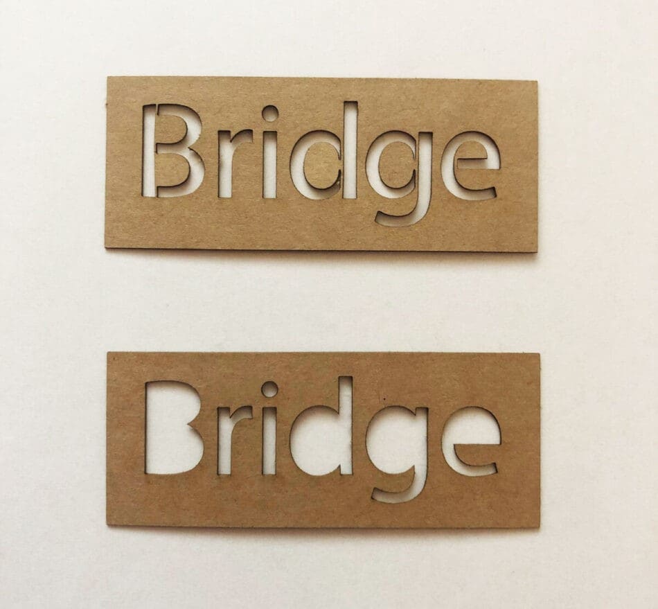
4. Wilder
For a more creative and personalized touch, Wilder is a handwritten sans-serif font that works well on wooden items. This font, with its marker-like texture, provides a fun look perfect for personalized gifts or rustic signage. Its rough, organic strokes are especially suited for wood engravings, bringing a natural charm to the design.
Wilder is available in several styles, including regular, bold, and oblique, offering a variety of ways to adjust its look. It works well on metal too, making it a versatile option for those looking for a more relaxed, handwritten aesthetic.
5. Futura
Futura is a sans-serif font with sharp, clean edges and consistent stroke thickness. This font stands out for its modern, sleek design and is especially useful for small text details in laser engraving. The geometric shapes of Futura make it both elegant and functional, providing a professional appearance on various materials. It works great on acrylic, glass, wood, and metal.
6. Farm House
Farm House is a vintage-inspired monoline serif font that’s perfect for engraving on wooden surfaces. Its bold, all-caps design gives a strong, attention-grabbing effect, ideal for logos, labels, and rustic signage. Its clean lines and vintage charm make it great for projects that need a classic, nostalgic look. The font comes with multiple style options, including regular, shadow, and textured fonts, allowing you to add dimension and texture to your engraving.
7. Bebas Neue
Bebas Neue is a bold, all-caps sans-serif font known for its clear, uniform strokes. This font is ideal for laser engravings that need to make a statement. Its strong, clean lines make it highly legible, ensuring that the text stands out on any surface.
The bold nature of Bebas Neue makes it perfect for projects that need high impact, such as signage or branding materials. Its simple but striking design helps create a modern look.
8. Stencil
For a more industrial or military-inspired aesthetic, the Stencil font is a great choice for laser engraving. Its design features thick lines with gaps between the characters, ensuring that the text is legible even on rough or textured surfaces. The stencil-style cutouts are perfect for engravings that need to stand out while maintaining a rugged look.
Adjusting Font Size and Spacing for Precision
The font size impacts how readable your engraving will be, especially when working with small text. And the spacing between lines plays a big role in the overall clarity of the design. Let’s see how to adjust these variables for precision in engraving:
Font Size
It’s possible to carve very small texts, sometimes as small as 1 mm or less, with laser cutting machines. However, you have to keep in mind that small texts may not always be readable, depending on the material and the type of laser used. It’s a good idea to test various font sizes before settling on the best one for your project. Some materials can handle fine details better than others, so testing ensures you find the perfect balance between size and legibility.
Line Spacing (Fill Interval)
Line spacing, also known as the fill interval, is the distance between each engraved line. The smaller the spacing, the finer the details, but it also means your engraving will take longer.
For clear, detailed engravings, a line spacing of around 0.25 to 0.30 mm is typically recommended. However, depending on your material and design, you may need to adjust this to find the right fit.
DPI and Its Impact
DPI (dots per inch) is another important setting that can adjust the text precision. A higher DPI setting means more detail, but it also requires more engraving time. Here’s a quick guide on DPI settings:
- 150 DPI: Best for rough engravings on materials like wood or leather.
- 300 DPI: The standard choice, offering a good mix of speed and detail.
- 600 DPI: Perfect for more intricate designs or small text on clear materials like acrylic.
- 1200 DPI: Used for extremely fine engravings, like small-scale text or detailed images.
Before you start your final engraving, always do a test run. This will help you see how the font size, line spacing, and DPI settings work together..
Applications of Engraved Fonts in Branding and Signage
Laser-engraved fonts are more than just a design choice; they can express the brand voice of an organization or add a personal touch to a gift item. Here are some examples of engraved fonts in branding and signage:
i. Business Signage
Laser-engraved fonts are often used in business signage because they offer a clean, sharp look that conveys professionalism. Fonts like Helvetica are popular for their simplicity and clarity. This makes them ideal for signs that need to communicate important information quickly. Other fonts, such as Futura, are great for smaller text because their geometric shapes make them highly legible even at reduced sizes.
ii. Storefronts and Retail Displays
In retail environments, the fonts on storefronts and displays can play a big role in shaping customer perceptions. Laser engraving adds a high-end feel, often giving stores a polished, upscale appearance. Engraving also adds texture, making the text stand out in a way that printed signage can’t replicate.
iii. Wayfinding and Directional Signage
Laser-engraved fonts are widely used in wayfinding signage, especially in places like airports, hospitals, and schools. These environments require clear, easy-to-read signs to help people navigate through spaces. Sans-serif fonts, like those used on road signs, are often chosen because of their legibility at a distance.
iv. Corporate Branding
For many companies, laser-engraved fonts are a part of their branding strategy. They are often found on logos, corporate stationery, and other marketing materials. Fonts like Stencil, Arial, the Champtone Fonts Collection, etc. help companies project an image that is both trustworthy and timeless.
Conclusion
Selecting the right laser engraving fonts is essential for achieving a professional result. Fonts like Arial, Helvetica, and Futura are perfect for legibility, while fonts like Champtone and Bebas Neue provide impactful, bold designs. Consider the material, engraving technique, and project style to choose the best fit.
At Zintilon, we understand the importance of precision in every detail. Our expert laser cutting services will bring your designs to life with the highest quality. We provide custom laser cutting, CNC laser cutting, and other services. Get a quote for your project.